 TinyMCE
 MoxieManager
 Drive
Drive

Read on to find out more about our best editor yet for building modern, internationalized and accessible content creation experiences. We’re also rolling out new two premium plugins which will help increase productivity and save time, as well as major updates to Tiny Comments and Tiny Drive.
We are thrilled to announce that TinyMCE 5 is now available for deployment into production environments. The end result of an intense year-plus development effort, TinyMCE 5 delivers significant improvements for developers who integrate and build upon the editor, for designers who need to seamlessly fit TinyMCE into their product or larger design system, and for end users producing the endless variety of creative content that is the heartbeat of their applications.
While some of you have been following along since the developer preview release last fall, and the subsequent beta, RC1, and RC2 releases, below are some highlights from all the goodness available in TinyMCE 5. Check out the release notes for the complete picture. And once you're ready to dive into the new editor, please try the cloud or self-hosted versions.
And if you're ready to talk now about how TinyMCE 5 could specifically help your application or project, please contact us. We'd love to chat.
Now—let’s get to the good stuff!
A shiny new component library
In TinyMCE 5, there is a completely rewritten library of 30+ UI components with the aim of saving teams the cost and time of building those components themselves. Components such as toolbars, menus, buttons, tab panels, and color pickers have been rewritten to make it easier to use the out-of-the-box UI. These components move beyond the JavaScript-heavy approaches used in previous versions and now use CSS Flexbox, SVG, and other modern technologies. All of the components are fully responsive, internationalized, and accessible.
In building the new library, the default design of the components was modernized. As an example, here is the new version 5 color picker versus the version 4 color picker.
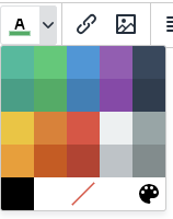
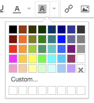
All of these changes have resulted in a more polished and modern user experience.
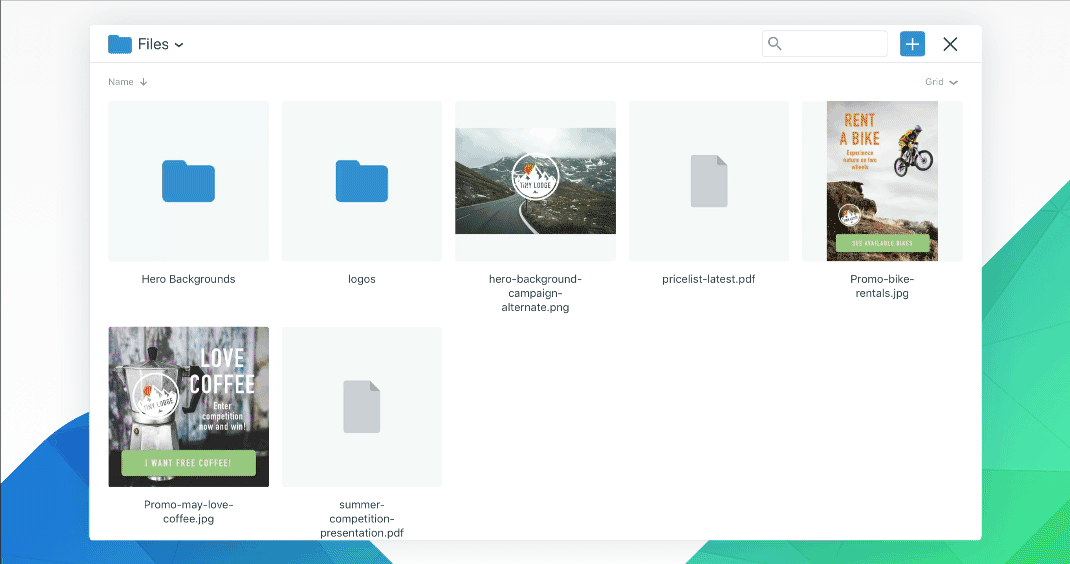
These UI components are shared with Tiny Drive, our image upload and asset management add-on. Try out a demo on the Drive product page, read the Drive developer guide, or dive into the documentation.
And as announced last month, Drive now offers multiuser support via a custom root path configuration option, as well as the ability to set a maximum image dimension on any uploaded files.
A simplified User Interface API
The new API makes it more straightforward to build custom experiences on top of the editor. Where there were previously many different, undocumented ways to do things, there will be now one fully supported way.
Among many benefits, the new UI API makes the process of creating dialogs simpler. The previous APIs in version 4 were largely undocumented and rather challenging to use. By comparison, version 5 is a breath of fresh air. With the version 5 UI API, you can create your own custom dialogs using JSON to setup UI components such as alerts, buttons, checkboxes, color inputs, drop zones, grids, tab panels and more. You can even create chained dialogs (otherwise known as wizards).
Autocomplete API
We're working on polishing up the documentation for the new autocomplete API, which enables word completion as a user types in TinyMCE. This API was created to simplify the premium Mentions plugin by moving the menu into the open source core, but during development, we realized the API was a match for the search box used by the character map and emoticon dialogs.
What started as an experiment is now a very cool Unicode character picker in the style that has become common among chat applications. Here's a preview:

Upgraded core and premium plugins
Tiny offers a suite of more than 50 official plugins that do everything from table editing to pasting from Microsoft Word. The plugin architecture enables TinyMCE to keep a lightweight core and still offer a powerful set of features for applications that need them. This suite of plugins has been updated to use the new component library and user interface APIs. With this update, no other rich text editor platform offers such a wide variety of plugins with modern UIs.
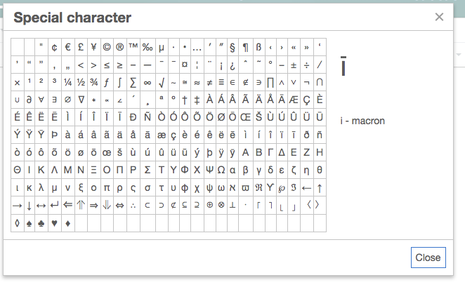
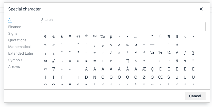
For a few of the plugins, there are new niceties that take advantage of features in the new components. For example, the Special Character plugin has received a new tabbed panel for organizing the characters:
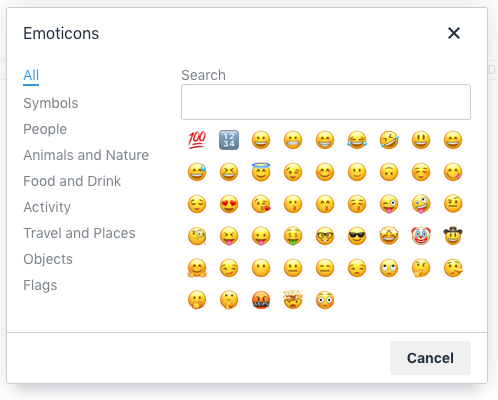
This dialog style is known as a collection, and because it's a shared component we extended the style to the Emoticons plugin. Version 5 now features a dialog and Unicode emoji characters instead of images.
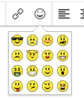
Emoticons plugin
Adaptive mobile and tablet support on by default
Although a majority of content creation still occurs on the desktop, it goes without saying that your application should fluently adapt to mobile and tablet users as well. Around 14% of TinyMCE’s CDN traffic is from mobile or tablet, and this is steadily increasing.
Starting in version 5, TinyMCE will now deliver the mobile theme within the editor package, and the mobile theme will be called whenever the editor detects a mobile device.
Skins that fit within your design system
In TinyMCE 5, we wanted to make it simpler to create a skin that would enable the TinyMCE UI to integrate easily with any design system. TinyMCE skins define all the variables you might need – colors, typography, sizing, spacing, and iconography. All in, there are more than 350 different variables you can tweak and they are the key to getting TinyMCE to fit like a glove in any design system. The new approach to skins in version 5 is much easier to work with and uses configuration variables instead of complex JavaScript.
There is also a great-looking default skin. The "Oxide" skin has been designed to be fresh yet familiar and it is a great starting point – particularly if your organization has not yet invested in a unique design system.
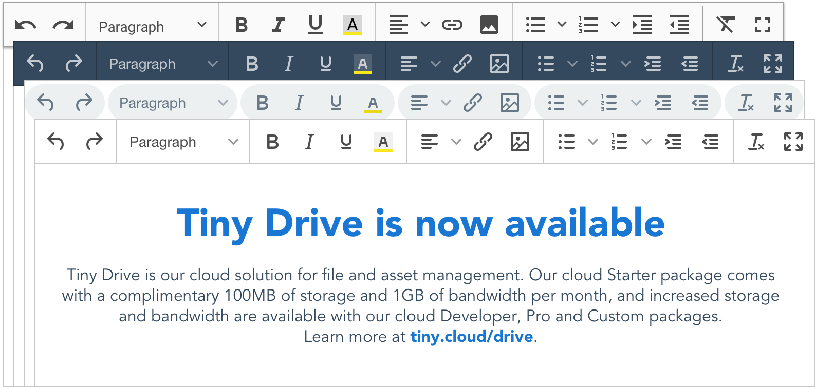
The first toolbar above shows the default TinyMCE theme, called Oxide. The second toolbar shows the dark theme. The third toolbar shows what we’re calling the “pill” theme, given the rounded corners of the toolbar shadowing. The final toolbar is based on the Material Design design system from Google. The dark theme is available at launch, and keep watching the blog for updates on when the pill and Material Design themes will be available, or you can sign up for our newsletter at the end of this post.
What’s next for TinyMCE 5?
There is an update to the TinyMCE Skin Creator tool for TinyMCE 5 in the works, and it should be available soon. In the meantime, you can build your own custom skins using LESS. You can also look forward to premium icon packs and even more themes in the same timeframe.
And we want to hear from you! What else would you like to see the editor do, or do better? Found a hole in the documentation? Have an idea for a plugin, or a new theme? Please contribute via Github -- and we’re even running a developer challenge through the end of February with the chance to win a $500 gift card and Tiny swag.
Permanent Pen and Page Embed now available in production
Production versions of the Permanent Pen and Page Embed premium plugins are available today as well.
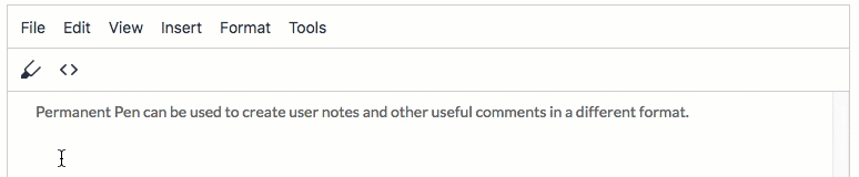
Permanent Pen enables you to add text in a different color or font from the default font settings so that the newly added text stands out from the rest of the document. For example, you would use Permanent Pen in collaborative projects where you want to markup a document with suggested changes or comments. The desired style is defined in the Permanent Pen properties, and then Permanent Pen is enabled via a toolbar button. When Permanent Pen has been toggled on, the style set in the properties will automatically be applied to all text entered in the document. This ability to store information for reuse saves the user time and ensures consistency across the content.
Page Embed enables an external web page to be embedded in content via an inline frame (<iframe>) element. The iframe with the embedded webpage can be responsive or restricted to a specific size.
Major update to Tiny Comments
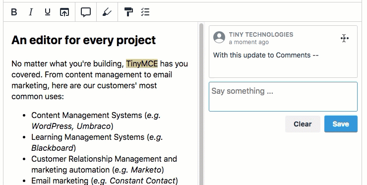
Today also brings improvements to the functionality of Tiny Comments. Comments now has its own comment storage solution, saving the comment text within the content. This change should make Comments more straightforward to implement, as the previous version required users to build their own comment storage solution.
Users will also now see a timestamp on comments, and be able to edit comments, delete individual comments, or delete an individual threaded conversation without deleting all comments. Comments will also invoke a "Show More / Show Less" toggle for any comment text exceeding three lines.
Thanks for reading. Please continue to check the Tiny blog for updates, follow us on Twitter and Github, or sign up for our newsletter with the link below.


